GoHarness
Redesigning the onboarding experience for a card-linked rewards platform for financial institutions, accelerating time-to-first-progress for new users.
The Challenge
GoHarness helps financial institutions run card-linked rewards programs — missions, gift card redemptions, and always-on earning. The mechanics were sound. New users were struggling to engage in a meaningful onboarding experience.
Per the client's own data, nearly half of trial users dropped off before ever seeing the value of a reward. In a credit union's secondary rewards offering, trust hadn't been earned yet — users were asked to act before the product had shown them why it was worth it.
After a full journey audit — from the first program email through to redemption — the goal became clear: lower the barrier to entry without diminishing the benefits and opportunities users had at their fingertips. The problem wasn't what the product was offering. It was when it was explaining itself, and whether users believed it when it did.
Discovery
Discovery centered on four user interviews spanning different experience levels and, more tellingly, different degrees of interest in the end product. We shadowed users through onboarding and mapped the existing flow against industry benchmarks.
Three key insights emerged:
- Terminology overload — the platform used internal jargon that didn't match users' mental models
- No progressive disclosure — advanced configuration was shown upfront, overwhelming first-time users
- Missing feedback loops — users couldn't tell if their experience was configured correctly.
"I spent 40 minutes setting up my first pipeline and it just errored out. I had no idea what I did wrong." — Senior DevOps Engineer
Framing the Strategy
Rather than redesigning screens, we reframed the problem as a behavioral design challenge. The work wasn't to add incentives — it was to reinforce human behavioral patterns and preferences by building confidence through small, validated wins.
We established three design principles:
- Show, then ask — demonstrate what a working experience looks like before asking users to build one
- Validate continuously — give real-time feedback on every configuration choice
- Escape hatches everywhere — let experienced users skip ahead without penalty
BEHAVIORAL JOURNEY MAP · 12 MOMENTS
THE PRE-ACTION RULE
Every email, text, and screen answers the user's next fear before presenting the next action. Fix timing, not complexity.
THE VISIBILITY RULE
Every meaningful action visibly moves something forward — delivered in the channel the user already uses. Surface movement, not bigger rewards.
GOHARNESS · BEHAVIORAL DESIGN ENGAGEMENT · 2023

The Solution
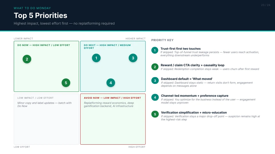
- Trust — answer the user's next fear before every ask; earn legitimacy in the first two touches.
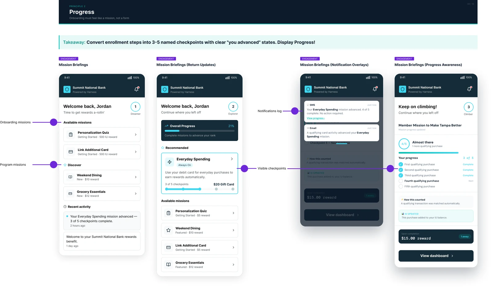
- Progress — make enrollment feel like a mission, not a form; every step should read as earned movement.
- Education — deliver the one sentence that resolves hesitation at the exact moment it occurs, not before or after.
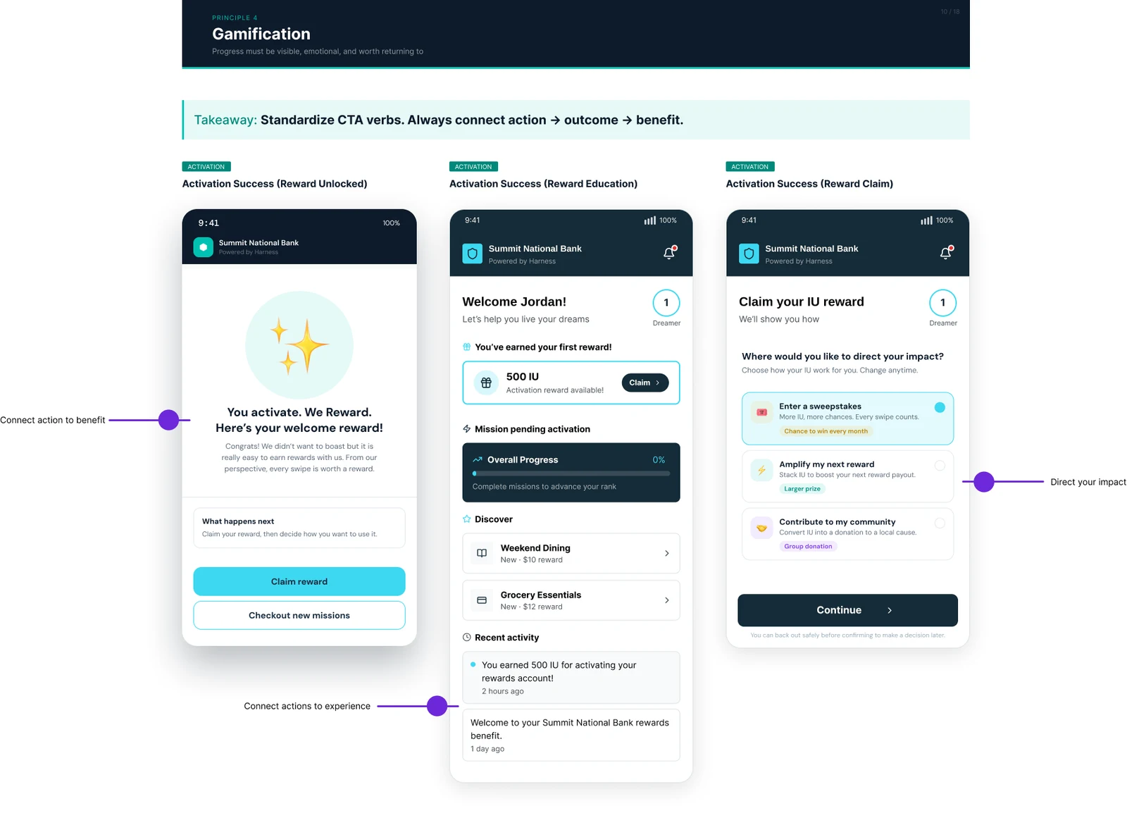
- Gamification — make progress visible, emotional, and worth returning to.
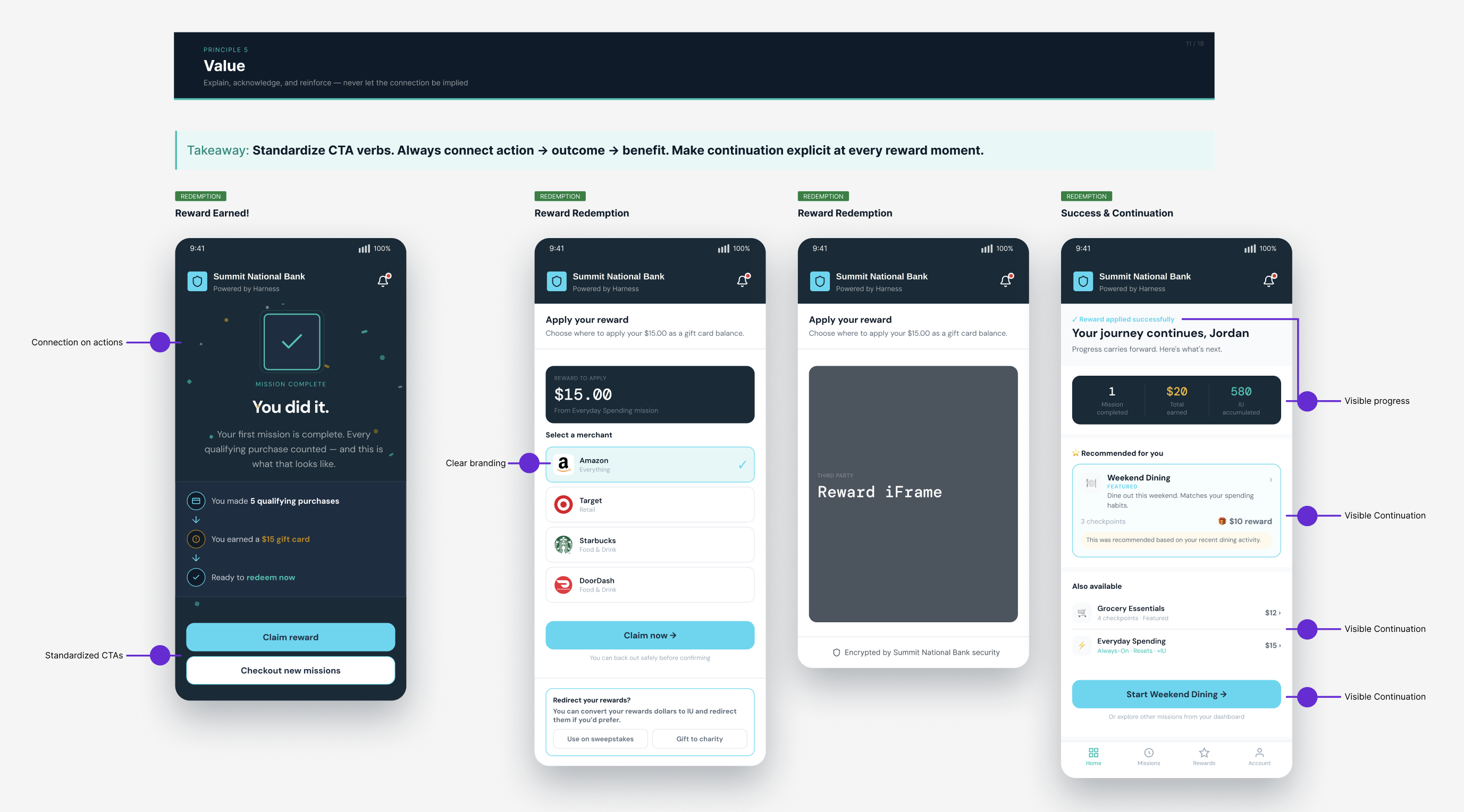
- Value — always connect action → outcome → benefit; never let the causal link be implied.
Results
A validated direction, and a commitment to build
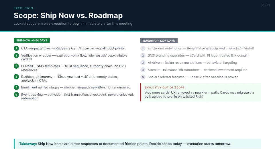
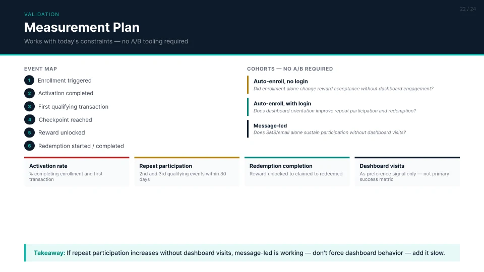
The engagement didn't produce shipped metrics — it produced conviction. The client responded strongly to the diagnosis and the principle framework, and committed, post-retainer, to rolling out the elements below.
Reflection
This project reinforced a principle I return to often: the best onboarding doesn't feel like onboarding. By treating the setup flow as a learning experience rather than a configuration form, we helped users build real competence — not just complete tasks.
The key leadership decision was resisting pressure to just "simplify the UI." Simplification without strategy often just hides complexity. Instead, we structured the complexity so users encountered it at the right moment, with the right support.